UI / Polish
General updates
For this checkpoint I focused on UI as well as fixing issues from last week’s testing. The UI elements added include a home, control, and score screens. As for the issues, the jumping animation has been fixed.
Font
All the screens use the same fonts from the dafont website. These fonts are 04b_30 for the titles and VCR OSD Mono for the general text and buttons.
04b_30:  VCR OSD Mono:
Title
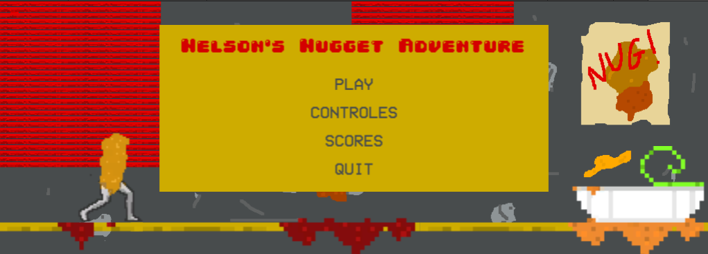
The title screen is made using your canvas, images, text and buttons to create a look that reflects the game. It depicts the default level background as its background with Nelson running on platforms to get to the sauce on top to type in to the gameplay. As for the menu, it is yellow backboard to stop the buttons and text from getting lost in the background. The text simply states the title of the game and the buttons from top to bottom say play, controls, score, quit. All the buttons are linked to their respective screens, for example when selecting play the first level of the game starts.
Control
After this the control screen was made in a very similar fashion. It has the same background with the yellow backboard on top. But this time the title reads controls, and the buttons are replaced with text saying how to move the character. Another added feature is a button in the bottom right corner that says back which allows the player to go back to the home screen. This screen was made to be simple and clear in communicating its message.

Score
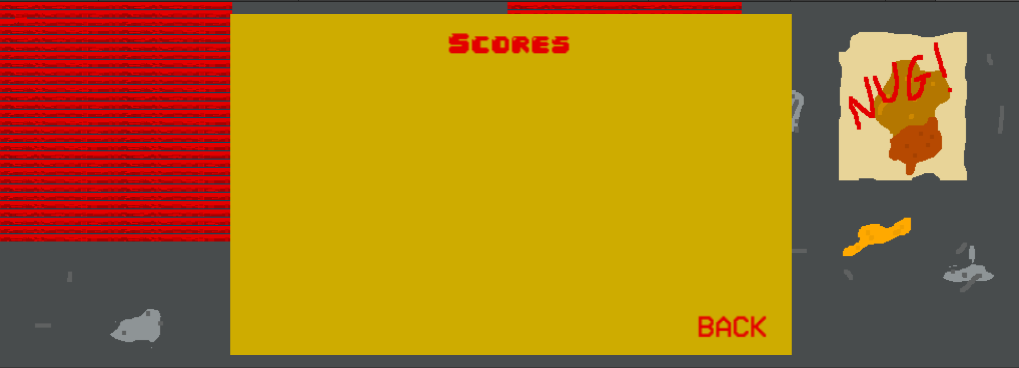
The last screen made was a scoreboard. It is almost identical to the control screen, but instead the title reads scores, and the rest is left blank for when the game is played and the scores will be displayed.

Result
All the screens are made to be very simple the same design qualities as the level such as a colourings and pixelated style to clearly reflect the actual game.
Feedback
Common comments about the new UI screens state that they are very clean and work well with the feeling of the game, helping to make it more immersive. Although one issue is that on the home screen Nelson, the platforms and the sauce are all a little bit blurry as they were not designed to be seen so closely. Also, a dumb mistake that had to pointed out to me is that controles is spelt wrong everywhere, but that's an easy fix.
But for the most part the game has become very clean and is ready for gameplay.
References
Leal, R., 2021. VCR OSD Mono Font | dafont.com. [online] Dafont.com. Available at: <https: www.dafont.com="" vcr-osd-mono.font=""> [Accessed 16 May 2021]. </https:>
Oshimoto, Y., 2021. 04 | dafont.com. [online] Dafont.com. Available at: <https: www.dafont.com="" 04.d4=""> [Accessed 16 May 2021]. </https:>
Nelson Nuggets Adventure
| Status | Released |
| Author | d.darius.s |
| Genre | Platformer |
More posts
- Final DevlogMay 30, 2021
- Presentation / GraphicMay 09, 2021
- Puzzle elementsMay 02, 2021
- Level BlockingApr 25, 2021
- Game ConceptApr 16, 2021
- Player MovementApr 16, 2021
Leave a comment
Log in with itch.io to leave a comment.